Jenessi - Identidade Visual
[PT]
Jenessi é um profissional em acabamentos e pinturas de escritórios, condomínios e reformas de residências de alto padrão.
Após 10 anos atuando sozinho, Jenessi viu que precisava de uma marca para se reposicionar no mercado e para abrir o seu próprio negócio com a sua equipe. Com o novo posicionamento, a marca pretende construir uma boa estrutura para atender seu público e formar uma equipe de profissionais de qualidade e que amam o que fazem.
[EN]
Jenessi is a professional in finishing and painting of offices, condominiums and high-end home renovations.After 10 years of acting alone, Jenessi saw that he needed a brand to reposition himself in the market and to open his own business with his team. With the new positioning, the brand intends to build a good structure to serve its audience and form a team of quality professionals who love what they do.

Branding
[PT]
Decidimos dar destaque ao nome Jenessi pela sua trajetória e pelo seu público que já foi conquistado até aqui.
"Para quem está construindo ou reformando, a fase de acabamentos para sua obra é considerada a cereja do bolo! Esse é o momento de pintar as paredes, escolher as bancadas, pisos e revestimentos, enfim… É quando a casa começa ter a sua personalidade."
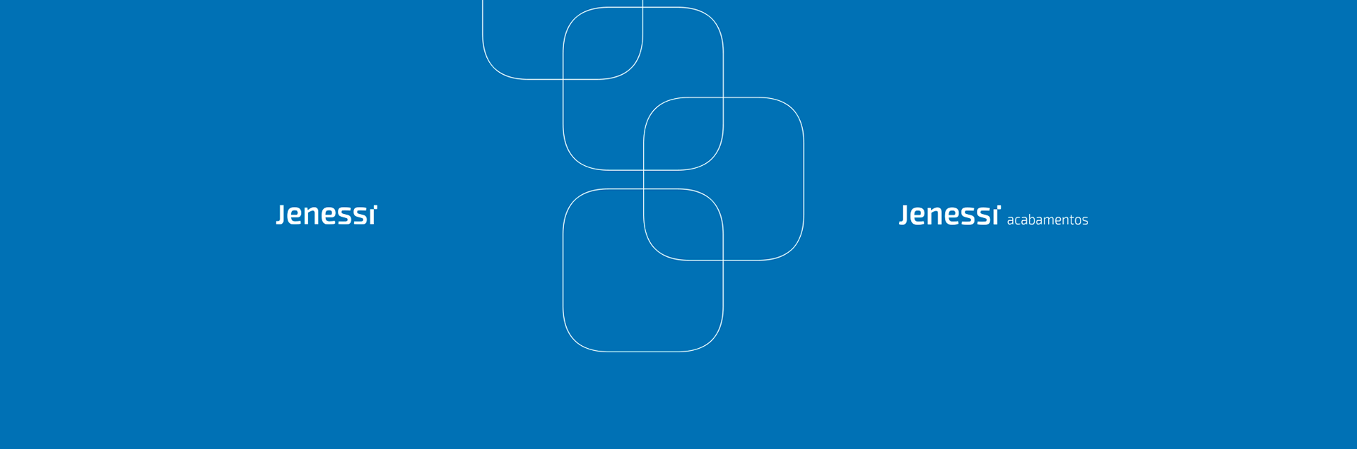
A tipografia escolhida foi levemente alterada para dar individualidade a marca. O ponto do "i" foi colocado pro lado representando a cereja do bolo ou que algo está incompleto, faltando posicioná-lo em cima para dar o toque final.
O nome Jenessi originou-se da palavra "Gênesis" que significa o Nascimento, ou o começo.
Segundo o livro de Gênesis o mundo era preenchido pelo oceano cósmico, formado pelas águas primordiais. As águas primordiais são frequentemente representadas como tendo originalmente preenchido todo o universo, sendo a primeira fonte do cosmos dos deuses ou Deus.
Sendo assim, os tons de azul representam e transmitem a essência, a excelência, a integridade e a seriedade da marca.
[EN]
We decided to highlight the name Jenessi for its trajectory and for its audience that has been conquered so far.
"For those who are building or renovating, the finishing phase for their work is considered the icing on the cake! This is the time to paint the walls, choose the countertops, floors and coverings, anyway ... That's when the house starts to have its personality . "
The typography chosen was changed for the individuality of a brand. The point "i" was placed to the side showing the icing on the cake or something that is incomplete, missing to position it on top to give the final touch.
The name Jenessi originated from the word "Genesis" which means Birth, or the beginning.
According to the book of Genesis, the world was filled with the cosmic ocean, formed by the primordial waters. The primordial waters are often represented as having originally filled the entire universe, being the primary source of the cosmos of the gods or God.
Thus, the blue tones represent and transmit the essence, excellence, integrity and seriousness of the brand.
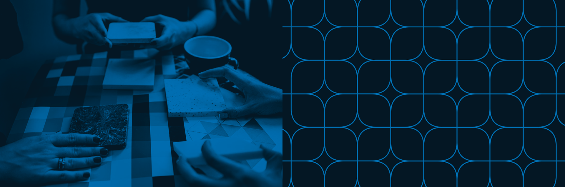
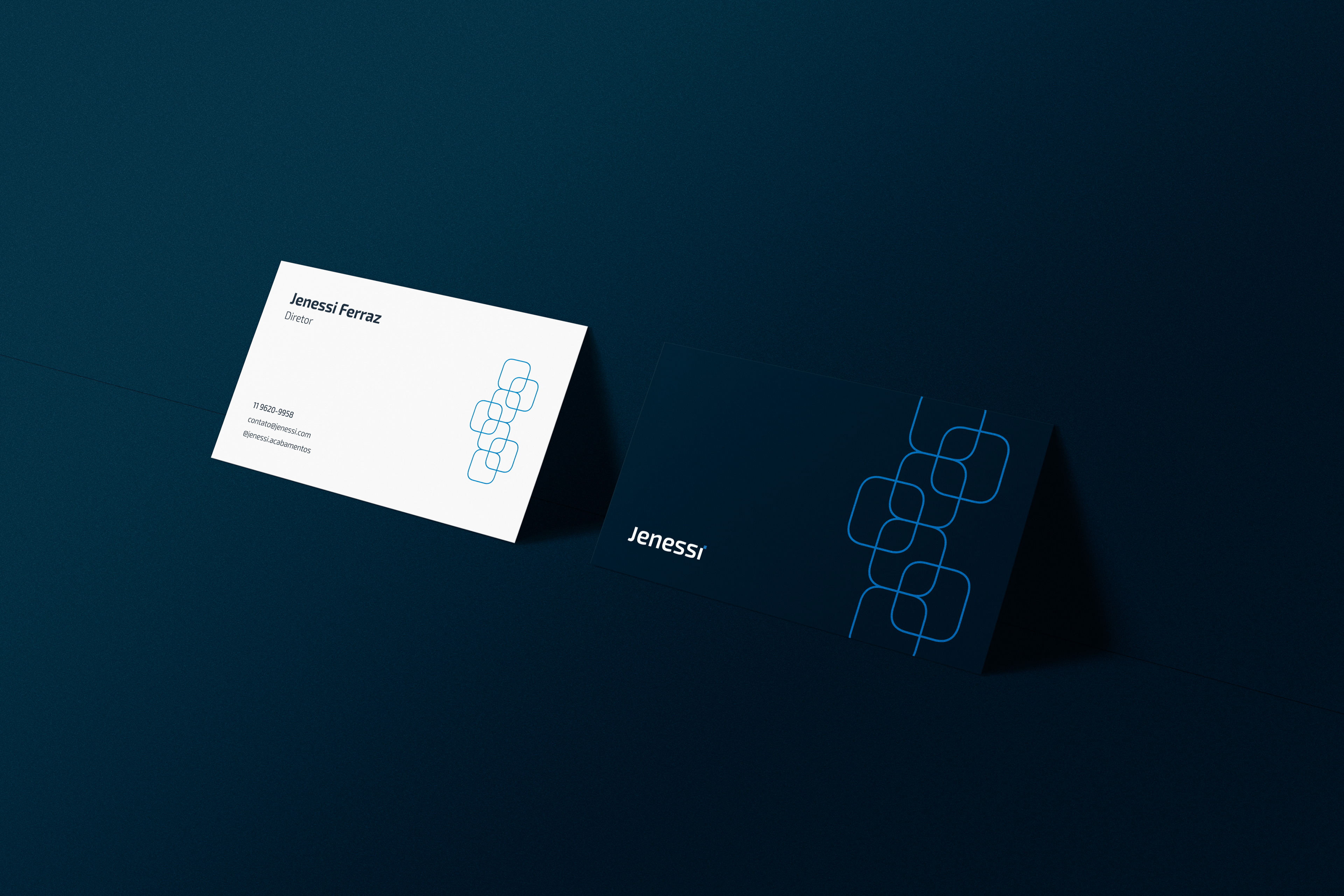
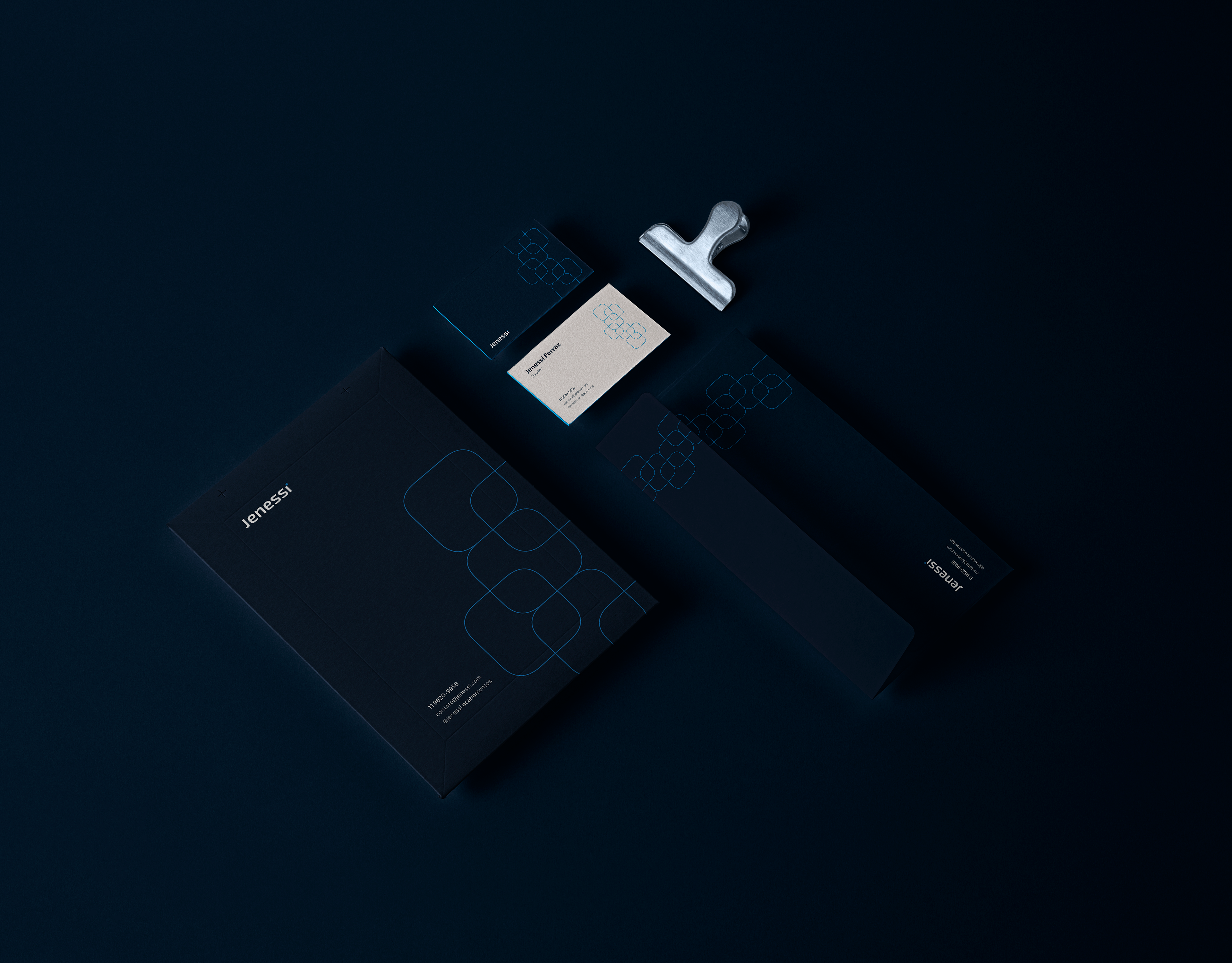
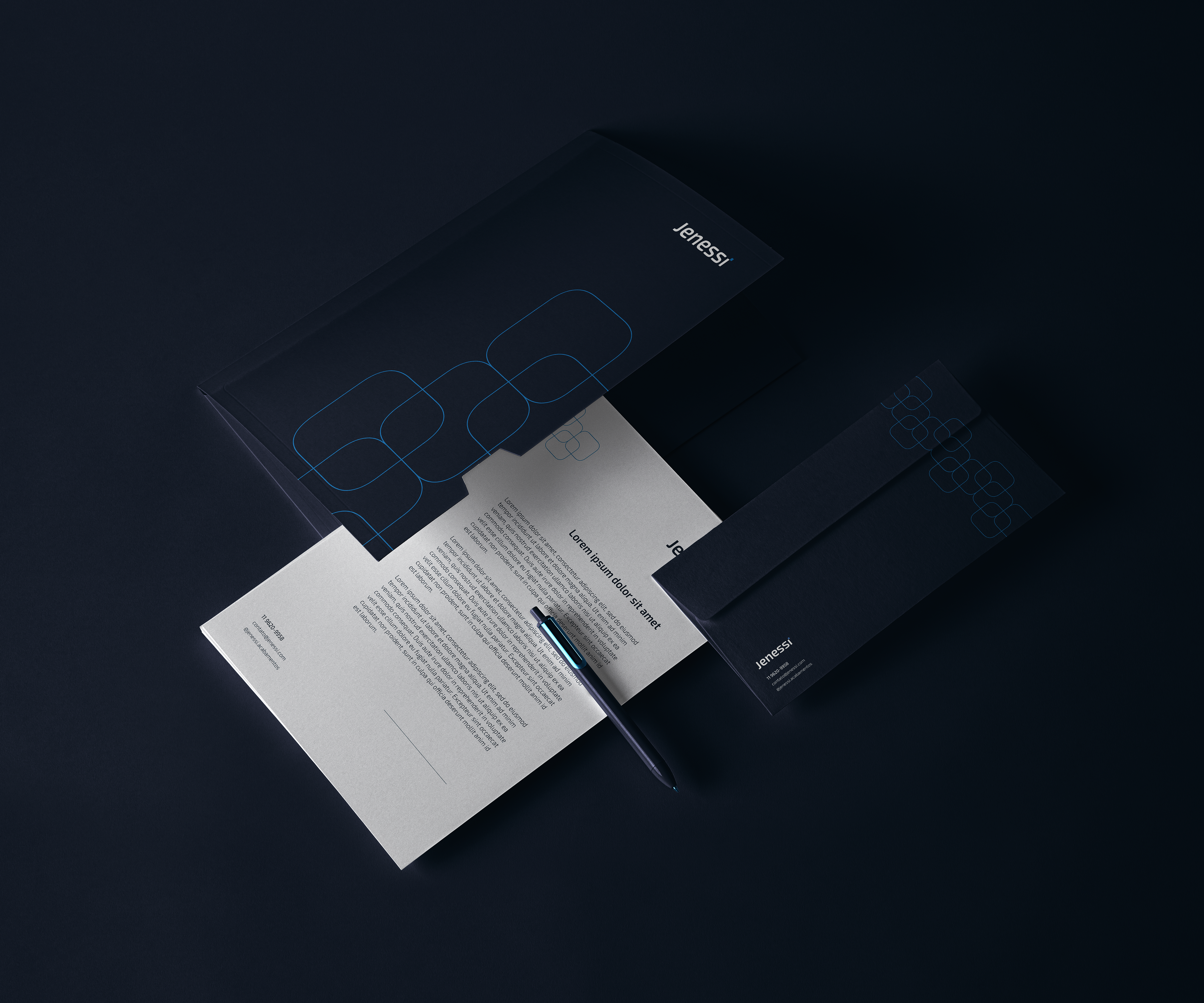
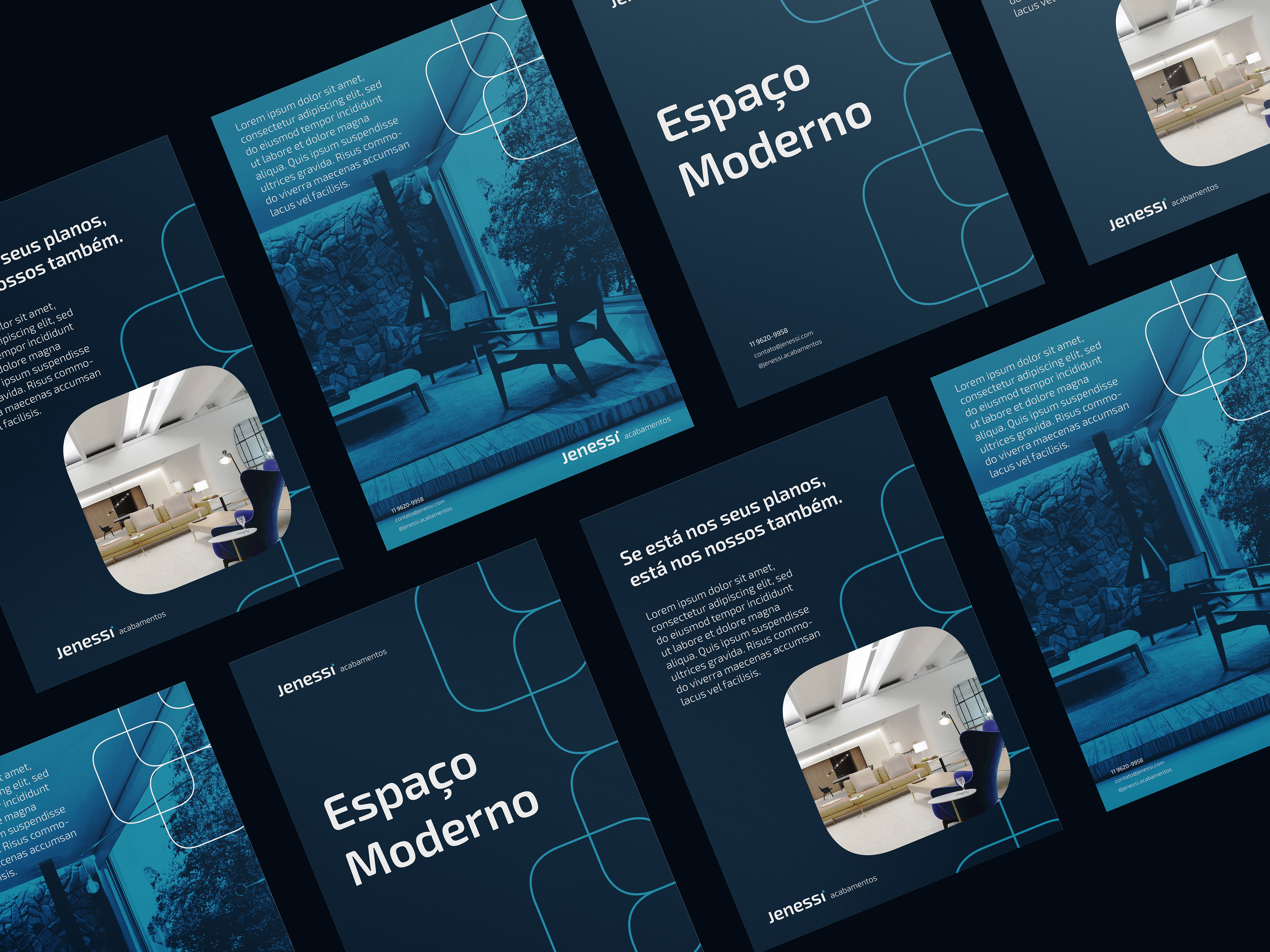
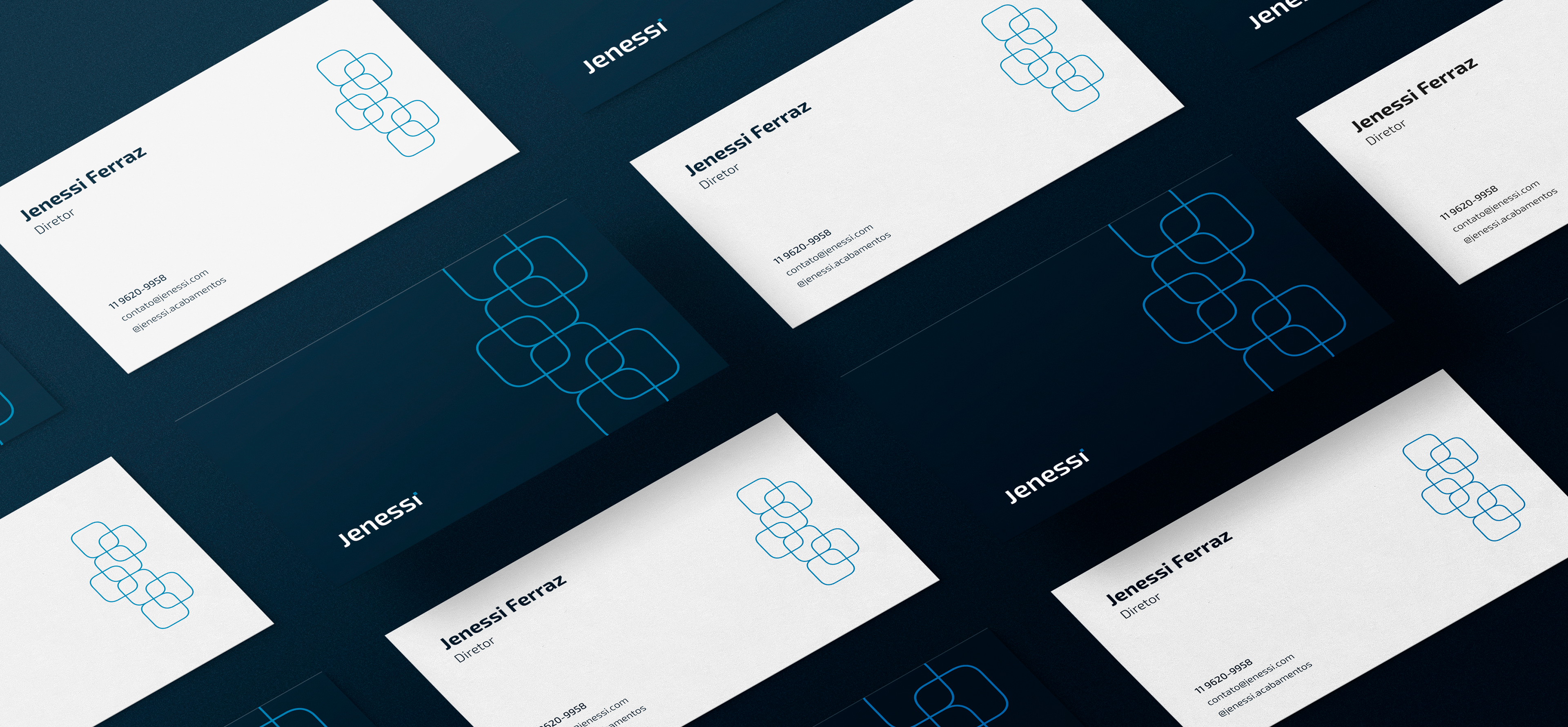
Elementos de apoio
[PT]
Na imagem vemos uma interação na qual o cliente está escolhendo sua textura de mármore preferida. Os elementos de apoio da marca tem a forma das peças de mármore que sobrepondo umas as outras demonstram a conexão e o relacionamento entre o cliente e a empresa.
[EN]
In the image we see an interaction in which the customer is choosing his favorite marble texture. The supporting elements of the brand have the shape of marble pieces that overlap each other demonstrate the connection and relationship between the customer and the company.